Branding | Packaging | Digital
Opening children’s eyes to the magic of rainforests.
Challenge
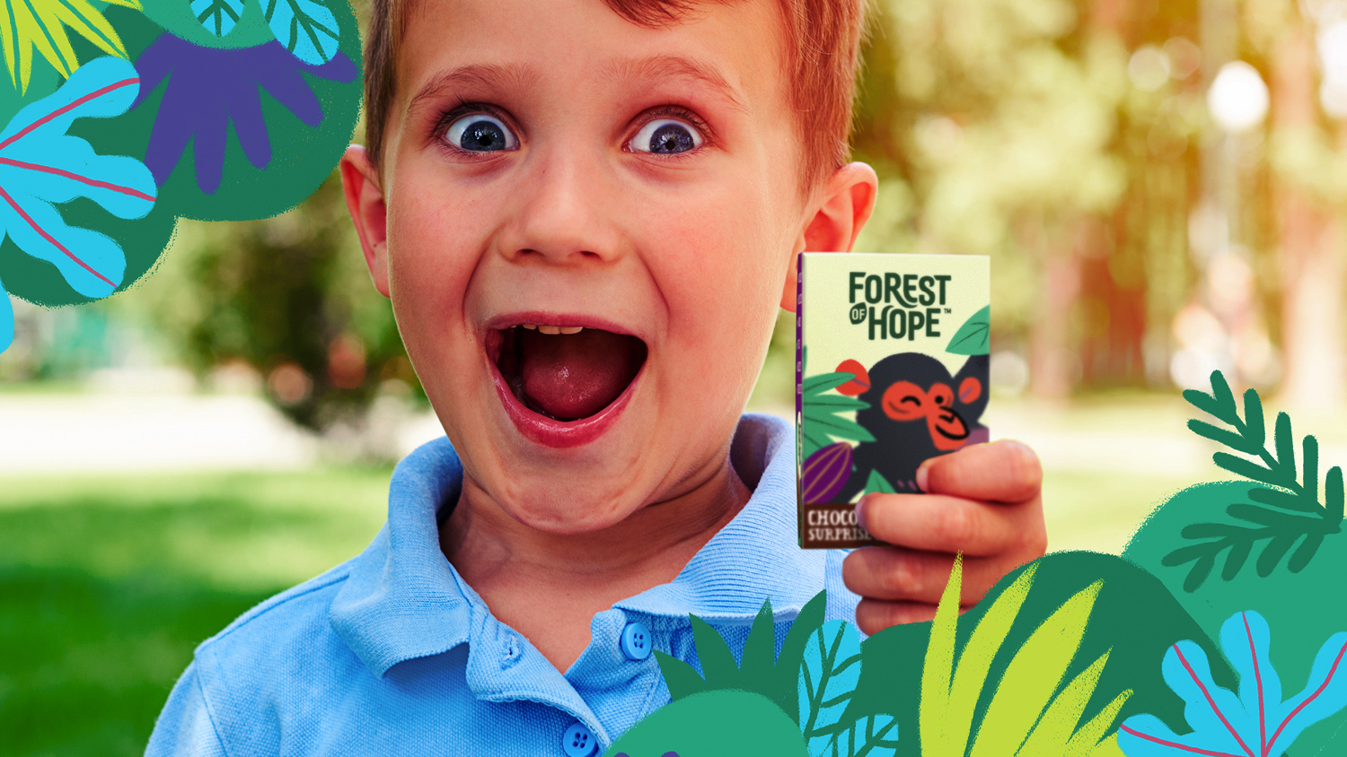
There is no shortage of ethical products in the market, but one demographic was being overlooked – children. Our challenge was to inspire and educate kids about environmental issues, in an engaging and playful way, starting with a plastic-free chocolate egg.
Approach
Forest of Hope™ was a name inspired by the nickname given to the
Gola Rainforest, where the cocoa beans are grown. The high levels of biodiversity and new conservation approach have given the area bags of potential. We wanted to capture a sense of optimism and positivity through the name.
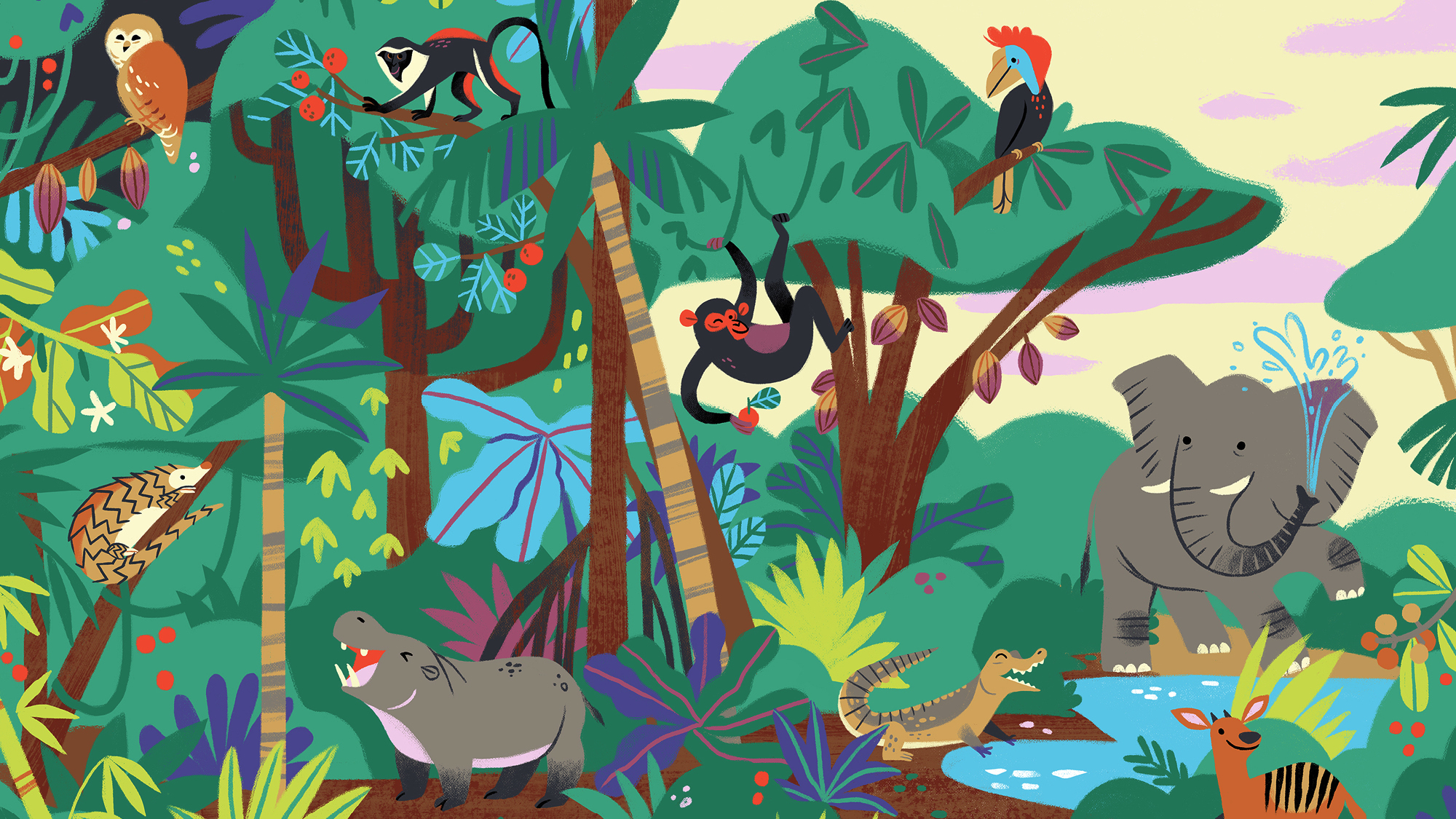
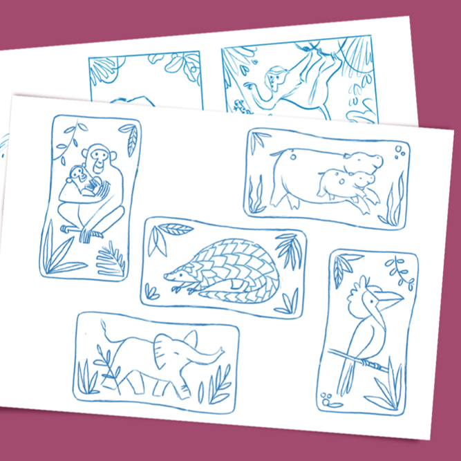
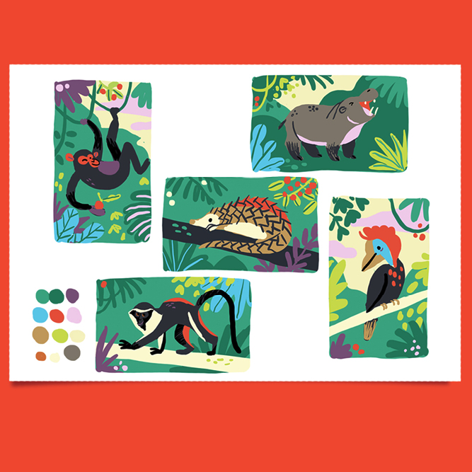
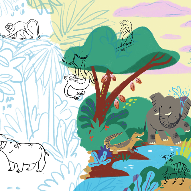
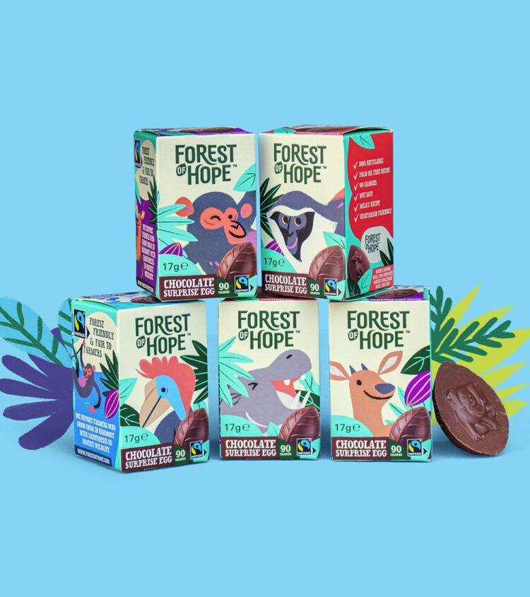
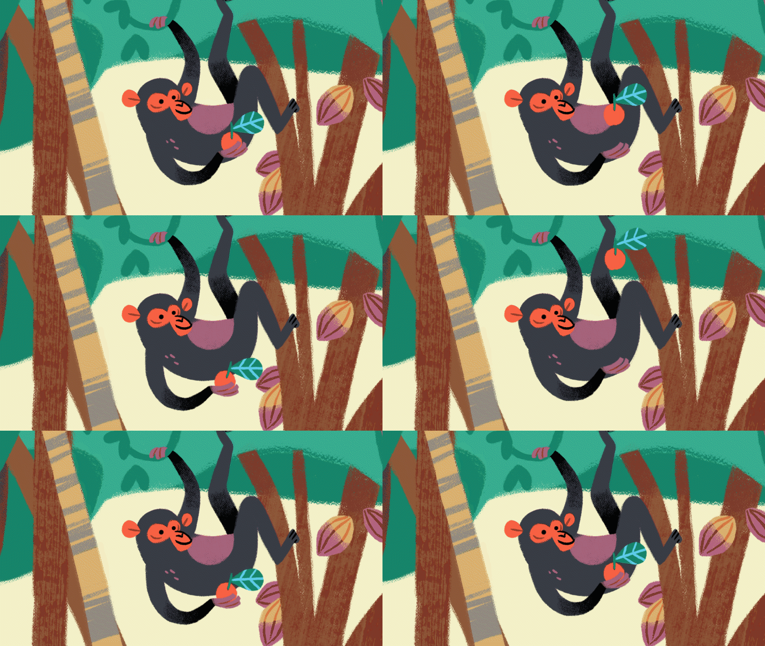
The story of hope inspired the whole range, as we curated a collection of bespoke and ownable animal illustrations based on endangered species that live in the rainforest. Each one with their own unique personality and quirks
We built the brand world and identity around three ideas:
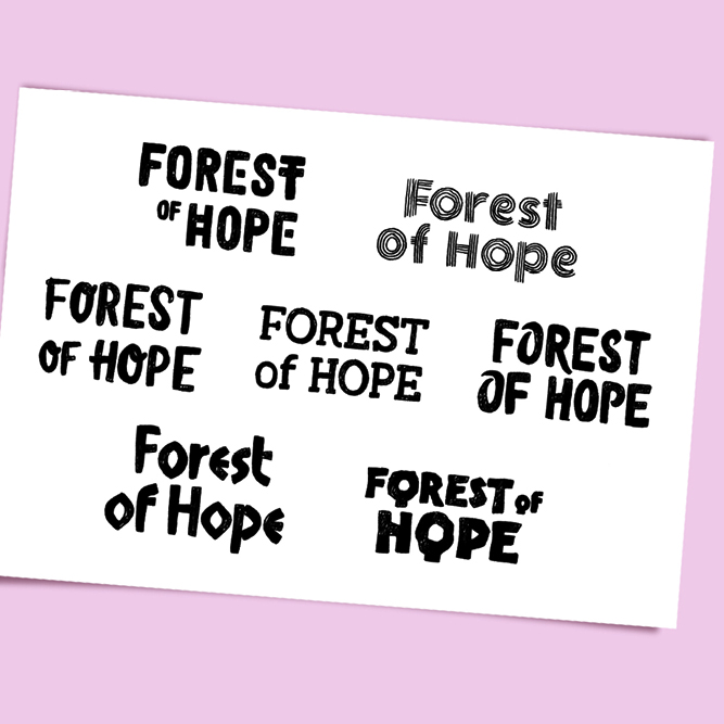
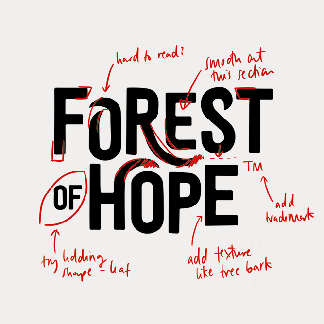
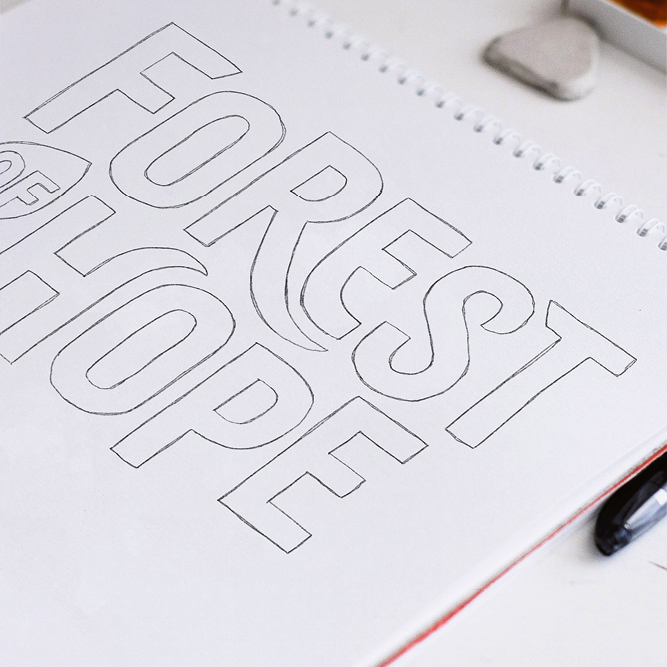
Growth – an abundance and celebration of life. Even the logo has a sense of movement and growth.
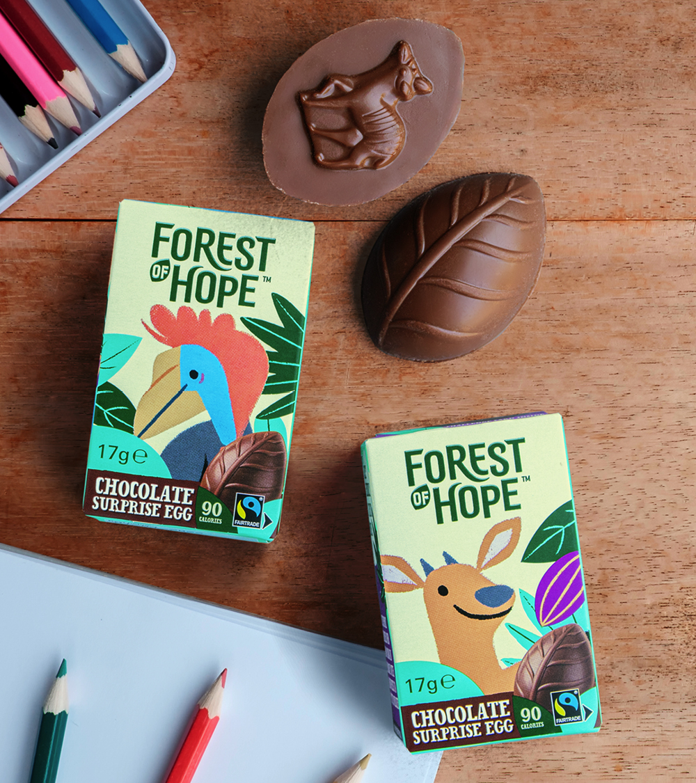
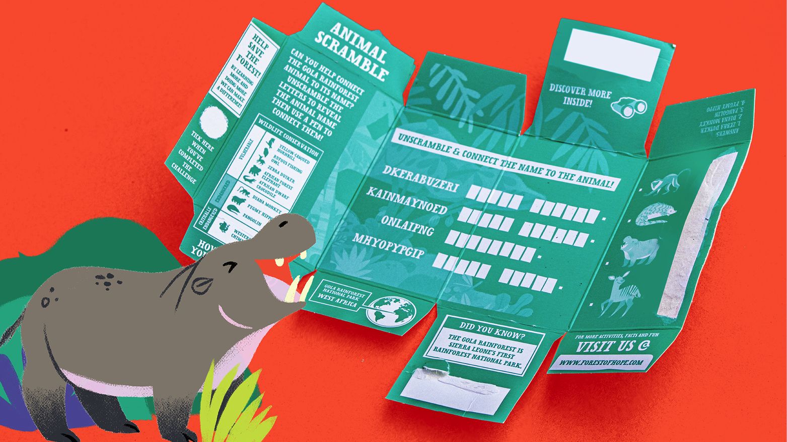
Play – communicating our message in a playful way. The packaging has cool learning activities and fun facts, teaching families about the Gola rainforest in a fresh way.
Surprise – Inside every egg is a mystery animal shape to discover.
Forest-friendly, Fairtrade accredited and fair to farmers, we are proud to help shake up children’s confectionery and play our own little part in doing some good for the planet.
“Honey have been the perfect partners in creating the Forest of Hope brand. Always full of great ideas, healthy challenges and a creative sharpness, they were able to create the distinctive brand world that we were looking for. The beautiful designs and charming branding are a strong reason why Forest of Hope has been so well received.”
Emma Perret, Marketing Controller at Zertus
