Strategy | Branding | Digital | Communications
A smarter solution for the pension market
Challenge
Punter Southall always take an innovative approach to developing pension solutions. One issue that has faced the industry for some time is the risk associated with a number of Defined Benefit schemes. Punter Southall needed our help to create a new brand and associated collateral for their latest solution.
Approach
We took time to understand the complexity of the market challenges before shaping the proposition: The Pension Safeguard Solution (PSS).
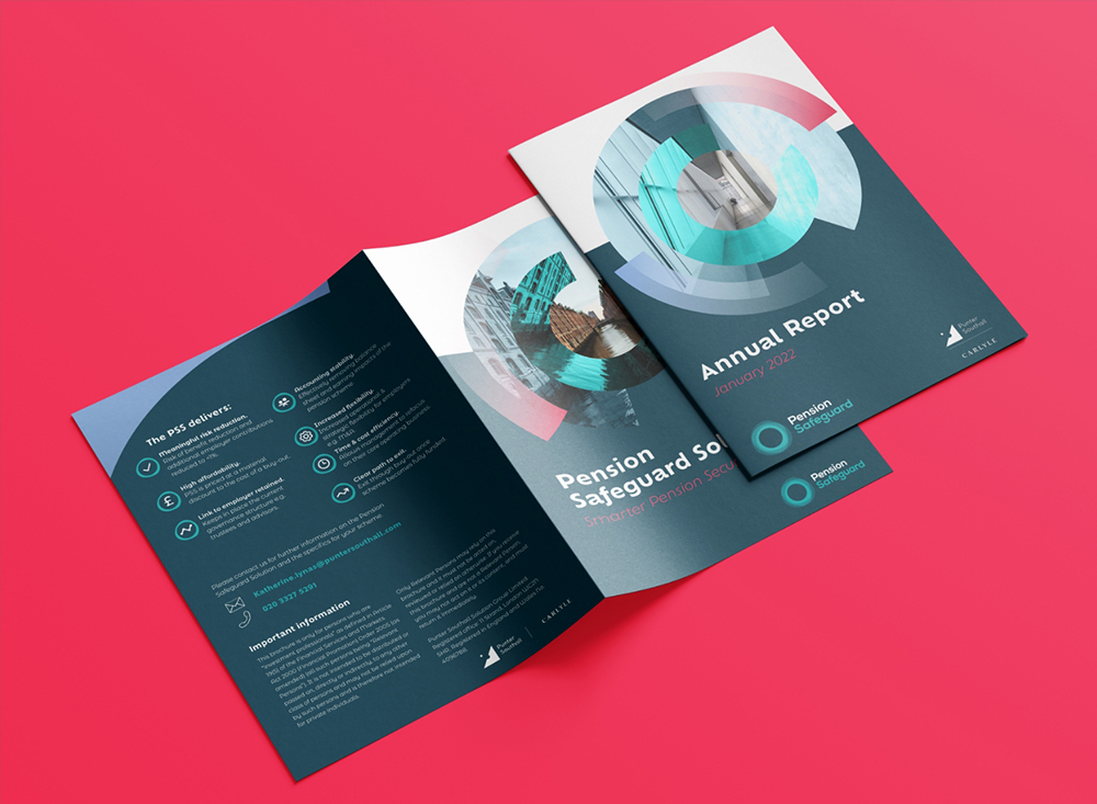
Enhanced pension security is at the heart of the new brand. We developed the idea of a protective wrapper in the brand identity and visual language to act as a metaphor for the financial stability that PSS provides for pension schemes.
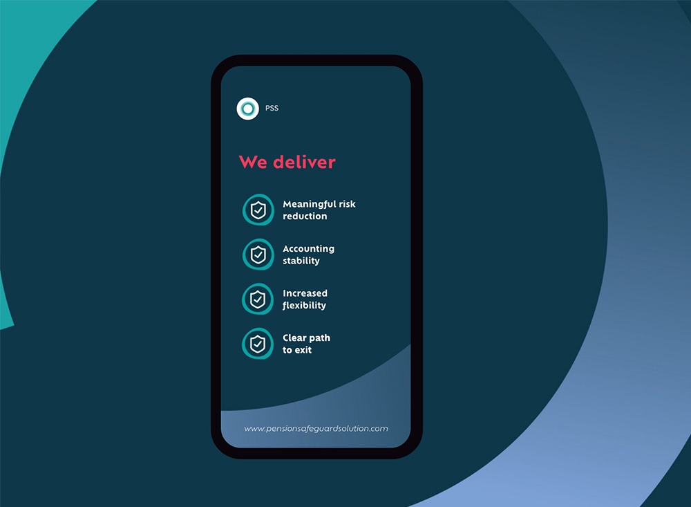
We wanted to ensure a bold, modern and fresh approach to all creative and branded collateral to cut through the swaths of traditional grey financial branding. For the website in particular, we designed dynamic animations to drive interest and stand out from staid competitor sites.
In a market dominated by jargon & complex language, we developed a tone of voice that was both refreshingly simple and reassuringly optimistic. The feeling of optimism was a key brand component that resonated throughout the visual identity and brand assets. This includes the brand’s photography style: imagery with clear paths to horizon lines in striking urban environments, to emulate the optimistic & forward-looking nature of the Pension Safeguard Solution.


“Honey are a great creative and flexible team to work with. They designed our new brand, the Pension Safeguard Solution, and then implemented our branded collateral from PowerPoint presentations to online ads and exhibition stands. They’re always available and tackle even the smallest (and hardest) requests with energy and enthusiasm.”
Katherine Lynas, Senior Consultant