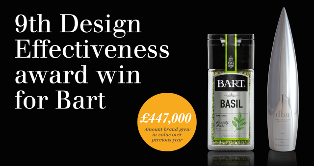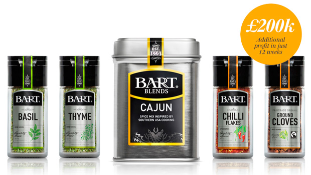
Honey wins Silver DBA Design Effectiveness Award for Bart Ingredients Company rebrand, delivering a 42.5% annual growth, and £200,000 additional profit in the first 12 weeks.
Honey is proud to win a DBA Design Effectiveness Award for their collaborative achievement in bringing 42.5% growth to the Bart brand through product innovation, strategic branding, and smart retail marketing. This is a major milestone for Honey and marks the 9th DBA trophy in their cabinet.
The coveted DBA is the world’s most recongised award for creative design that directly leads to commercial growth. Entries are independently judged by a panel of senior business executives, who look for effective and coherent design strategies that deliver a return on investment.

Honey’s entry stood out from this year’s strong competition because of its unique demonstration of stunning design, well-thought-out innovation, and the outstanding results it has achieved for the client. Lulu Laidlaw-Smith, Commercial Director at Honey says, “As a team this makes all our efforts worthwhile – we don’t get out of bed to win awards, we want success for our brands through market growth, but winning a DBA is the fizz, the excitement and realization that others appreciate your efforts.”
The challenge was to differentiate the Bart brand from the market leaders and increase brand awareness in reaction to own label incursion. Honey approached the brief by following the product journey from the retail environment to the home discovering key insights along the way that lead them to question the existing herb and spice category, and eventually reinvent its user experience.

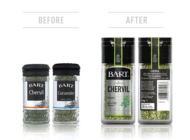
Honey repositioned the brand to reach new audiences of foodies and creative cooks stretching their spice usage in the kitchen. They changed the name from Bart Spices to Bart Ingredients Company to suit this positioning. The logo was made bigger, bolder and more modern. This was backed up with educational stories and illustrations on the packaging to inspire consumers, which led to an increase in brand loyalty and encouraged multiple purchases.
After consumers buy herbs and spices they usually store them in a dark cupboard where they are inaccessible and difficult to find. Honey’s design team came up with the idea of changing the packaging colour to silver, enhancing through reflection of light and communicate Bart’s premium quality.

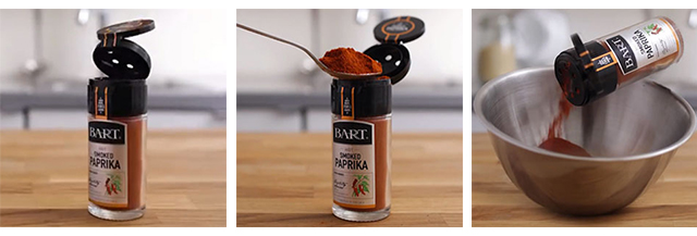
When people do finally come to use their herbs and spices they often find it difficult to shake out the right amount, especially if the ingredients have compacted at the bottom. Honey’s solution was to completely reinvent the lid, creating a two-way flip top that allowed easy access with a teaspoon.
“The past 18 months have been an extremely exciting time for Bart and it has been great to see the creative ideas come to life. We believe that our rebrand will resonate with our existing audience of discerning cooks, and help us branch out to new customers.”
Camilla Bond, Head of Marketing at Bart