Trend or fad; logic or laziness; love it or loathe it. There has been plenty of debate about the apparent move by branding experts to simplify brand marks.
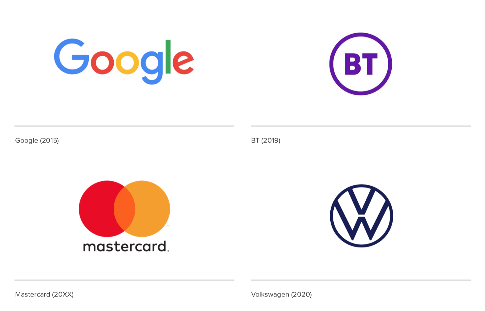
Going back to the Google rebrand in 2015, and more recently with BT, Uber, Mastercard, VW and BMW, it’s the use of simplified solutions, to the logotype at least, that allow brands the freedom to evolve and ensure they have the flexibility to take advantage of the different media available to them today.
Whilst many (including industry experts) call it a dumbing-down, a lack of imagination or even worse, a disregard for brand equity, we believe there is compelling method in the so-called madness.
The quest for brand experience
If you can remember those simple times before the internet and smartphones, key applications for a rebrand were certainly more limited so more time was spent crafting the logotype itself to try and differentiate it and make it more memorable.
Now, with broadband speeds and 5G approaching as standard, brands are more interested in creating multi-sensory experiences, intertwined with customers’ lives. Finding more ways in which to create stronger bonds with their audience, where the logotype can act more as a frame or canvas, is the key.

The logotype is only one piece of the puzzle
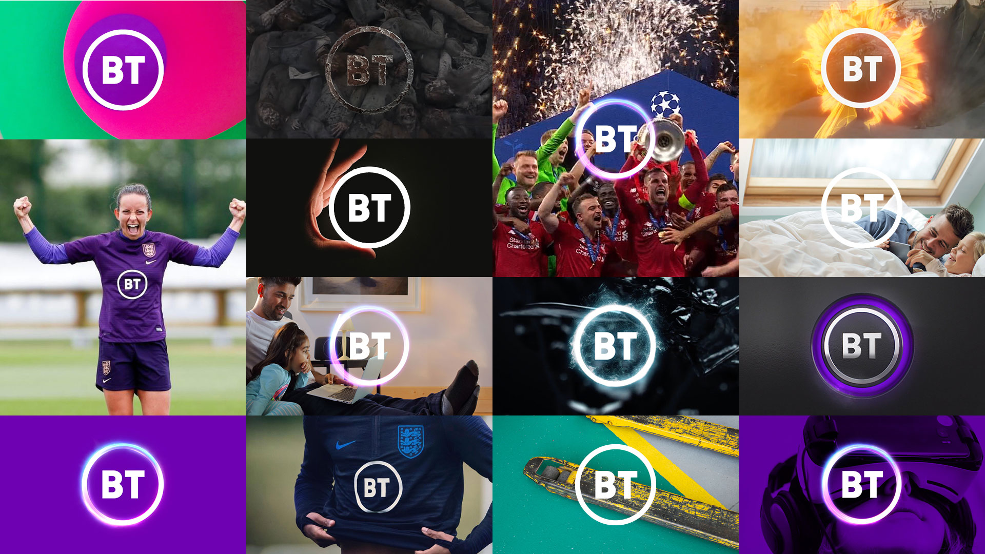
Businesses invest heavily in their brands, and rightly so. A logotype serves as a visual representation of a brand. A lasting symbol of what it represents. But when viewed on its own it can often say very little, and when it becomes the sole focus of a rebranding exercise, which it often does, you’re losing sight of the bigger picture. The redesigned BT logotype was heavily criticised, but the headlines featuring a simple black and white logo on its own were misleading. The brand looks unrecognisably different when the logotype is put in context with the rest of the brand assets.
Freedom of application
The communication mediums continue to change at breakneck speed. It’s the use of simplified solutions, to the logotype at least, that allow brands the freedom to evolve and ensure they have the flexibility to take advantage of the different media available to them today. Marketeers need to be thinking of how their brand works across a hundred-and-one different platforms and formats.
The rise of the much-maligned Gen Z
But is it just the advancement of technology, or could it be more to do with the people who use and consume it?
Gen Z have grown up glued to a phone. Being technologically advanced from an early age, they’re also accused of having short attention spans: an ‘8-second filter’ that helps them to curate their feeds and focus on what matters to them in a world where they’re bombarded by information and demands on their attention. But this is not just younger people; technology is part of many lives, and demands attention from everyone.
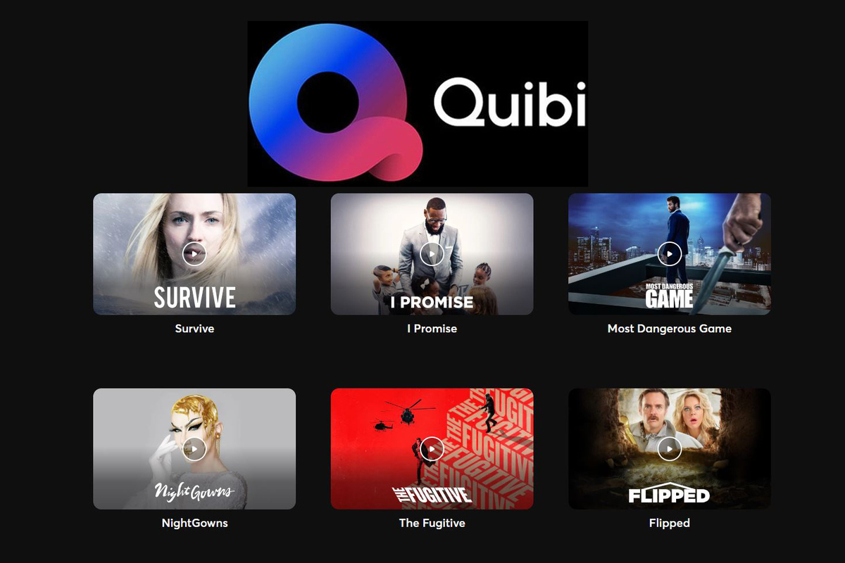
This has ultimately led to ‘shortform’ content emerging across all media. It is characterised by highly engaging, abbreviated and concise narratives, augmented or complemented by interactivity and multimedia content. Indeed, a shortform mobile video content platform called Quibi – “Quick Bites” – which launched in March 2020.
What does it all mean?
Bold, simple brand marks have more chance of being recognised, remembered and engaged with. They have more chance of being processed by consumers’ overloaded brain bandwidths and have more scope with which to adapt and flex across different media. They may be simpler, but they also form a framework for imagination.
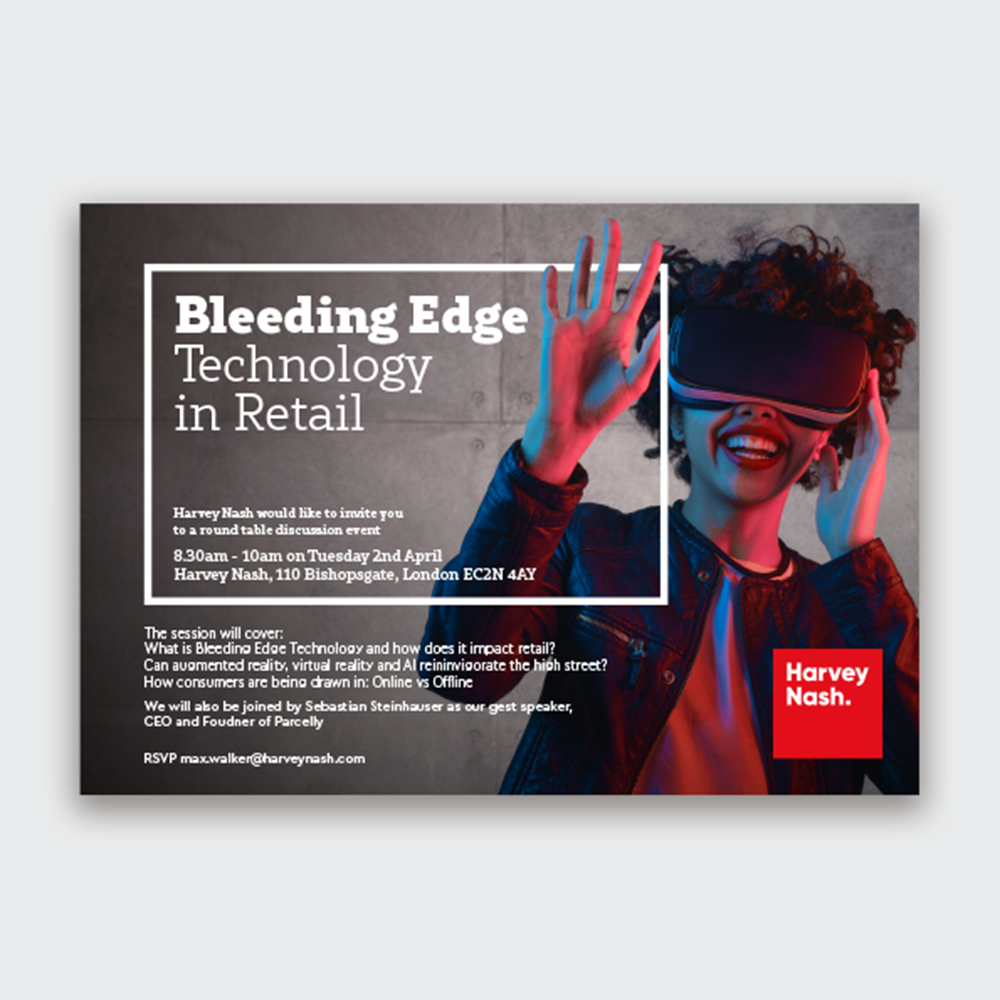
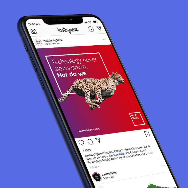
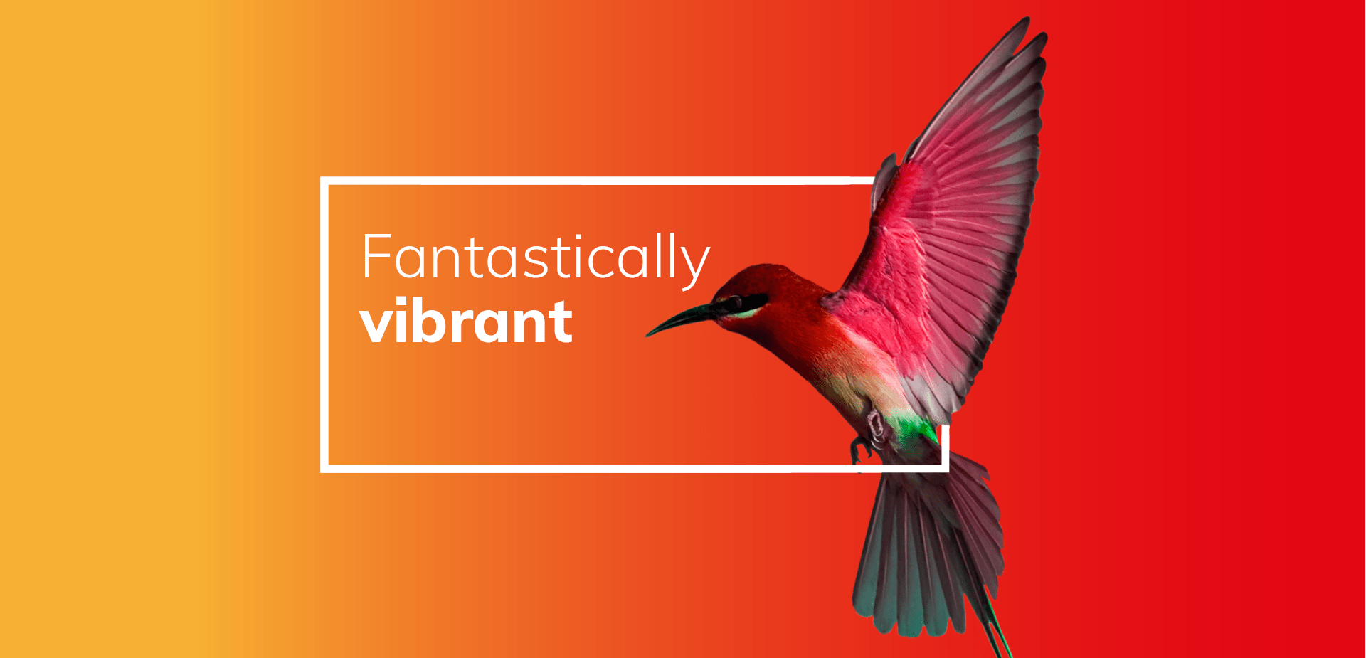
Our work for tech recruitment consultants Harvey Nash and their sister company, NashTech, embraced simplicity as part of a clear and streamlined vision for the brand.
The identity was pared down and their entire brand received a facelift, centred around a small handful of simple graphic elements. No matter the medium, device, or application their values speak loudly without having to shout.
