Strategy | Branding | Communications
As if rebranding the world’s largest LNG producer wasn’t enough of a challenge, Qatargas had done little to keep their brand up to date since they were established in 1984.
Other global producers, with stronger brands were gaining market share, and so Qatargas decided it was time to invest in developing their brand.
Our brief was to define a new brand positioning, emphasise Qatargas as a world class service organisation, and create a unique visual language that would support their vision and differentiate them from their competition.
We conducted 40 separate interviews and workshops with staff, business partners and customers around the world to help define a new brand positioning and brand values.
When this was presented and agreed, we sought permission to refresh the logotype, keeping it fresh and contemporary (previously outside of the brief).
We then started to develop the brand language and tone of voice, in line with the new positioning ‘The World’s Premier LNG Company’.
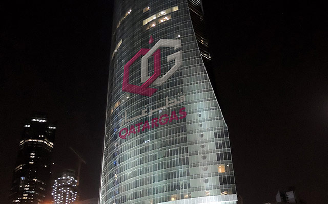
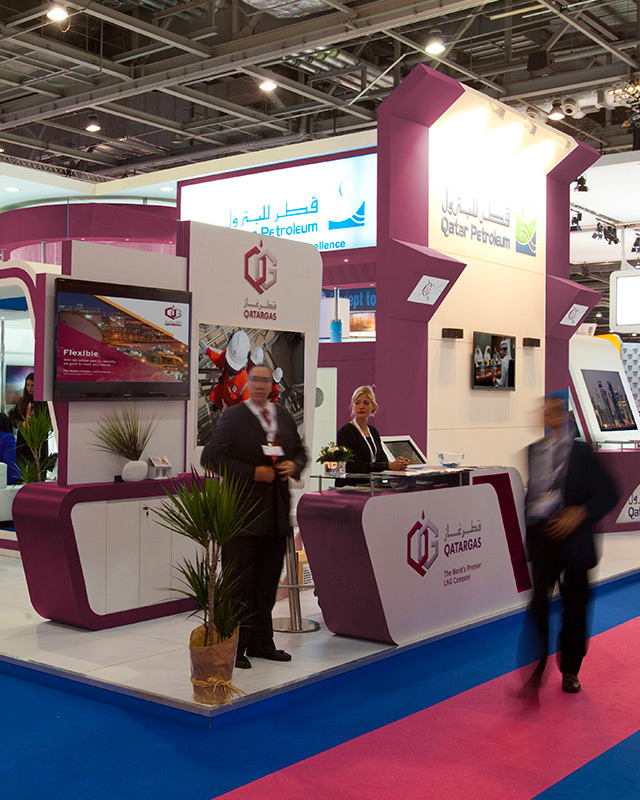
The logotype was redrawn with a 3-dimensional render, helping Qatargas to stand out in their marketplace and reflecting the growing importance and relevance of the digital arena.
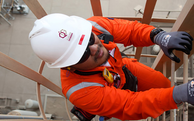
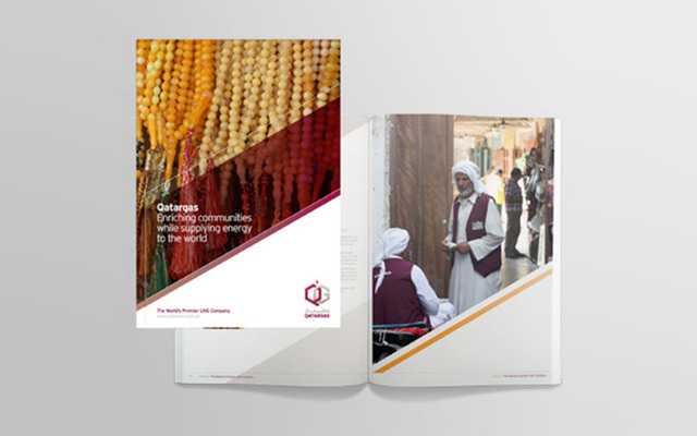
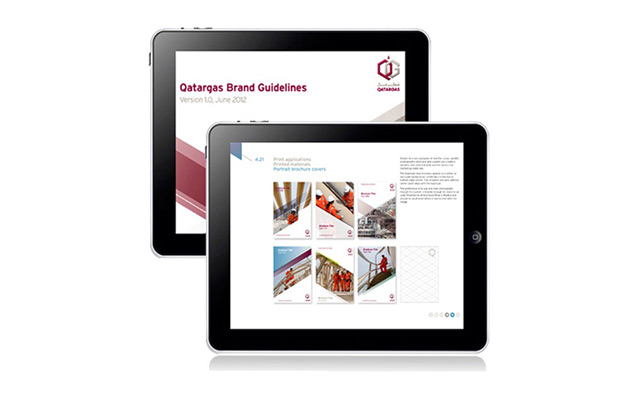
A new brand styling was then developed for all marketing materials, from advertising and brochures, to presentations, signage and vehicle livery. This new styling, derived from the angles of the logotype, looks fresh, modern and dynamic, complementing the new colour palette, typefaces and photographic library that we also developed.
