Branding | Packaging | Communications
Challenge
Kerrymaid is a key brand for the Kerry portfolio. With the aim of bringing the pleasures of dairy to everyone, the brand had lost its way and relevance amongst fierce competition in the B2B sector.
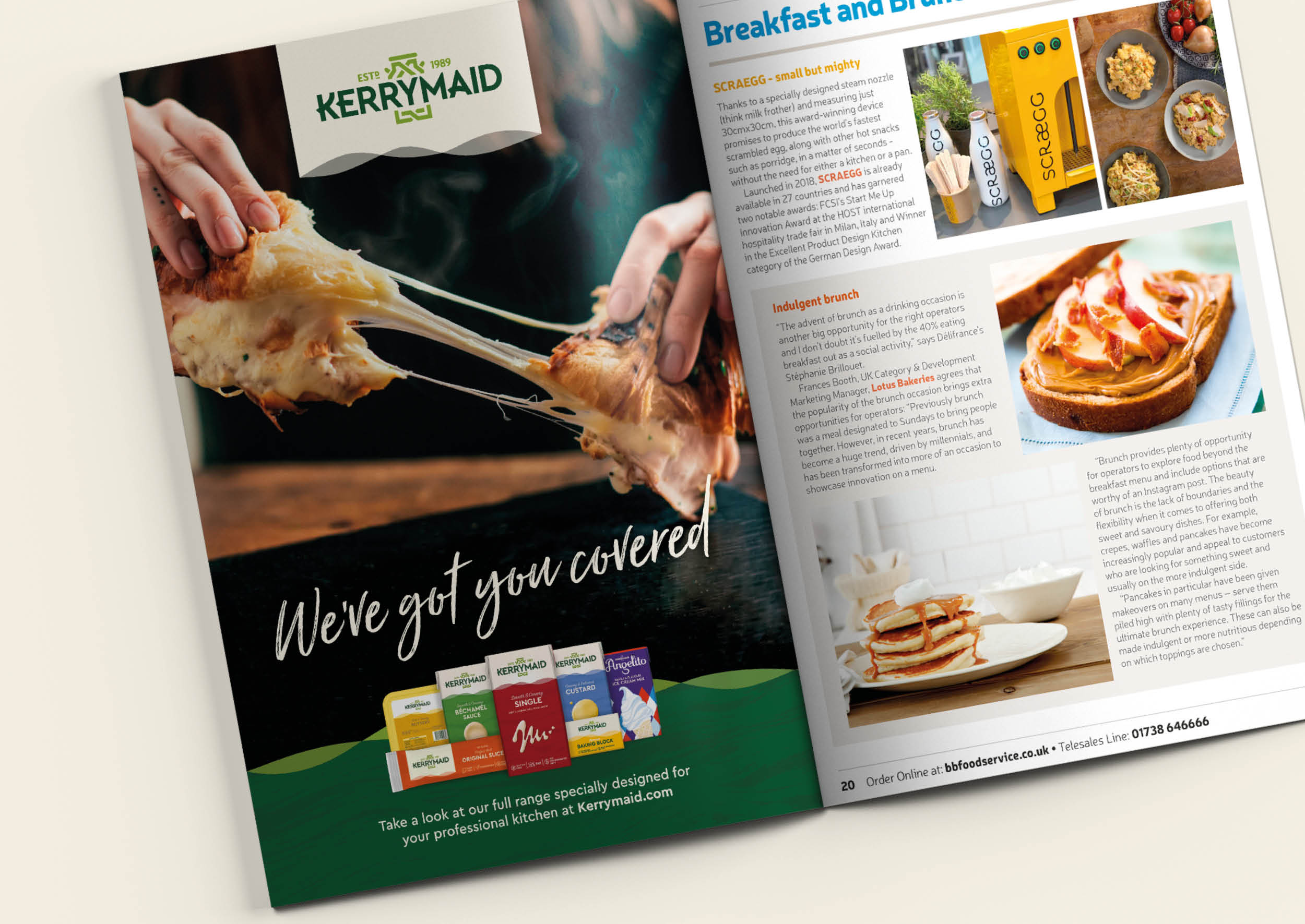
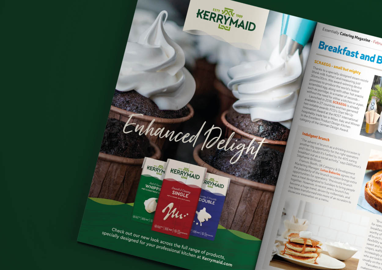
Honey was asked to redesign the brand identity, packaging and create campaign assets to relaunch the brand and establish Kerrymaid again as the leader in the B2B dairy sector.
Approach
With competition focusing on traditional dairy codes, we put the chefs and cooks at the heart of our brief, creating a concept that highlights the value that Kerrymaid brings to a professional kitchen: versatility, high performance and simplicity.
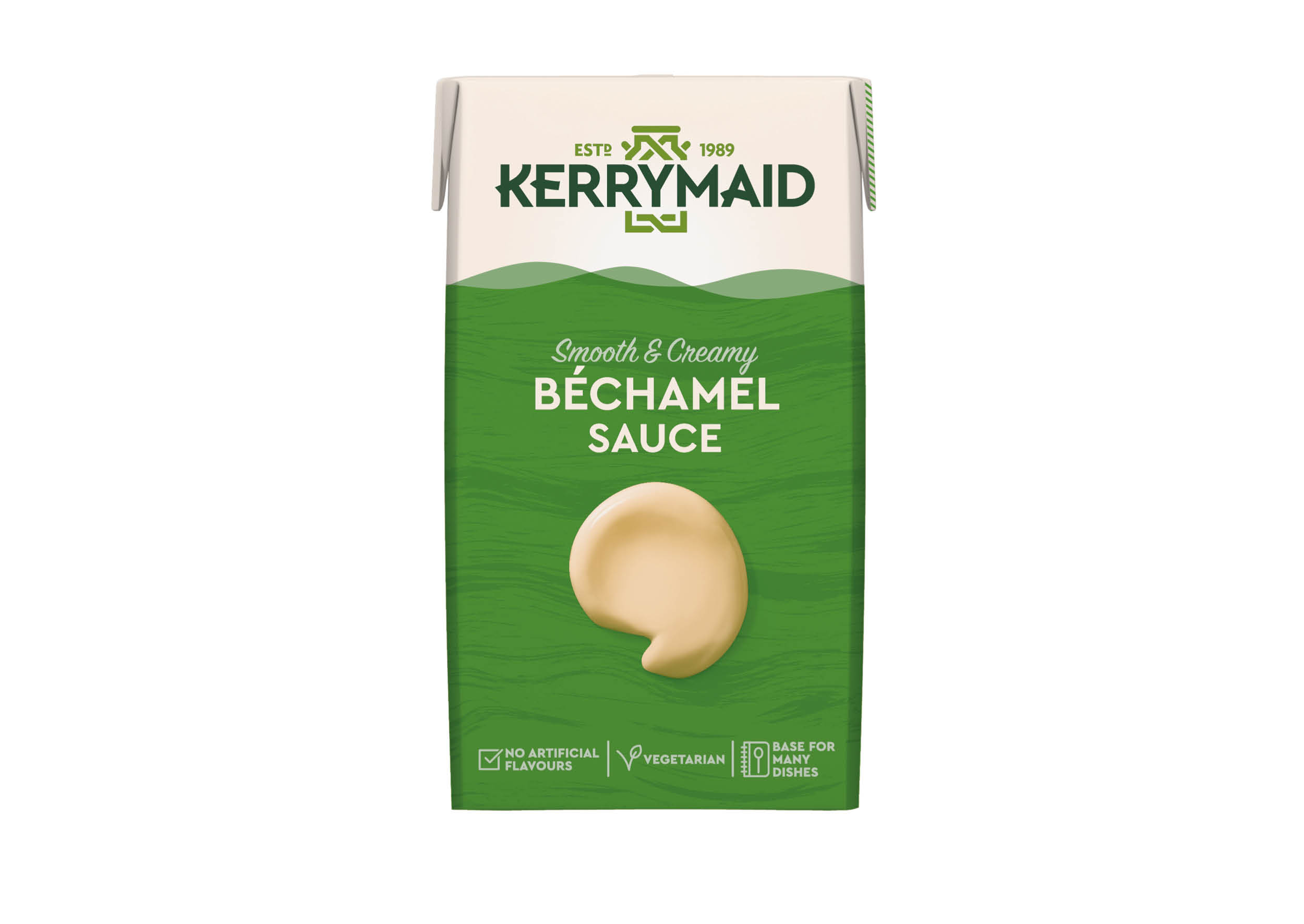
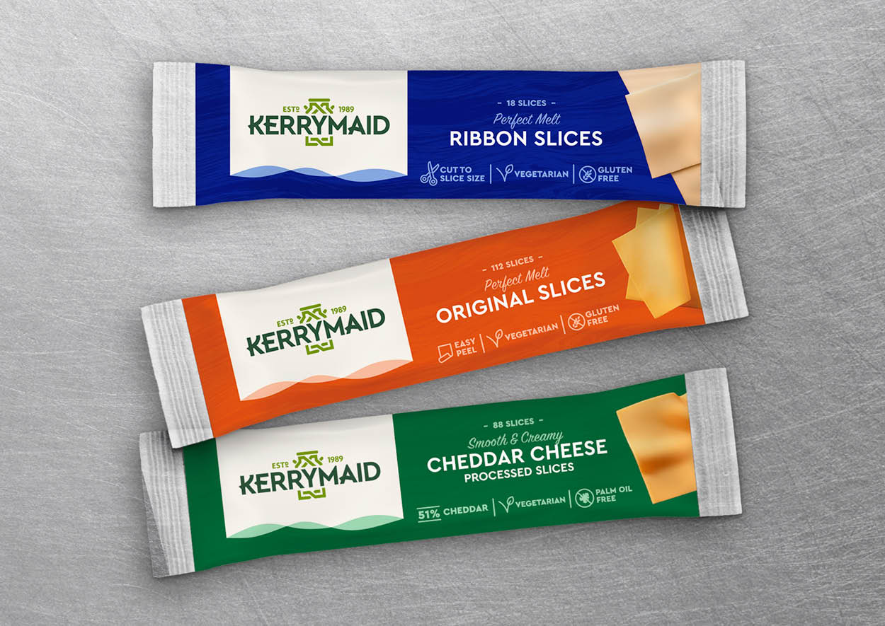
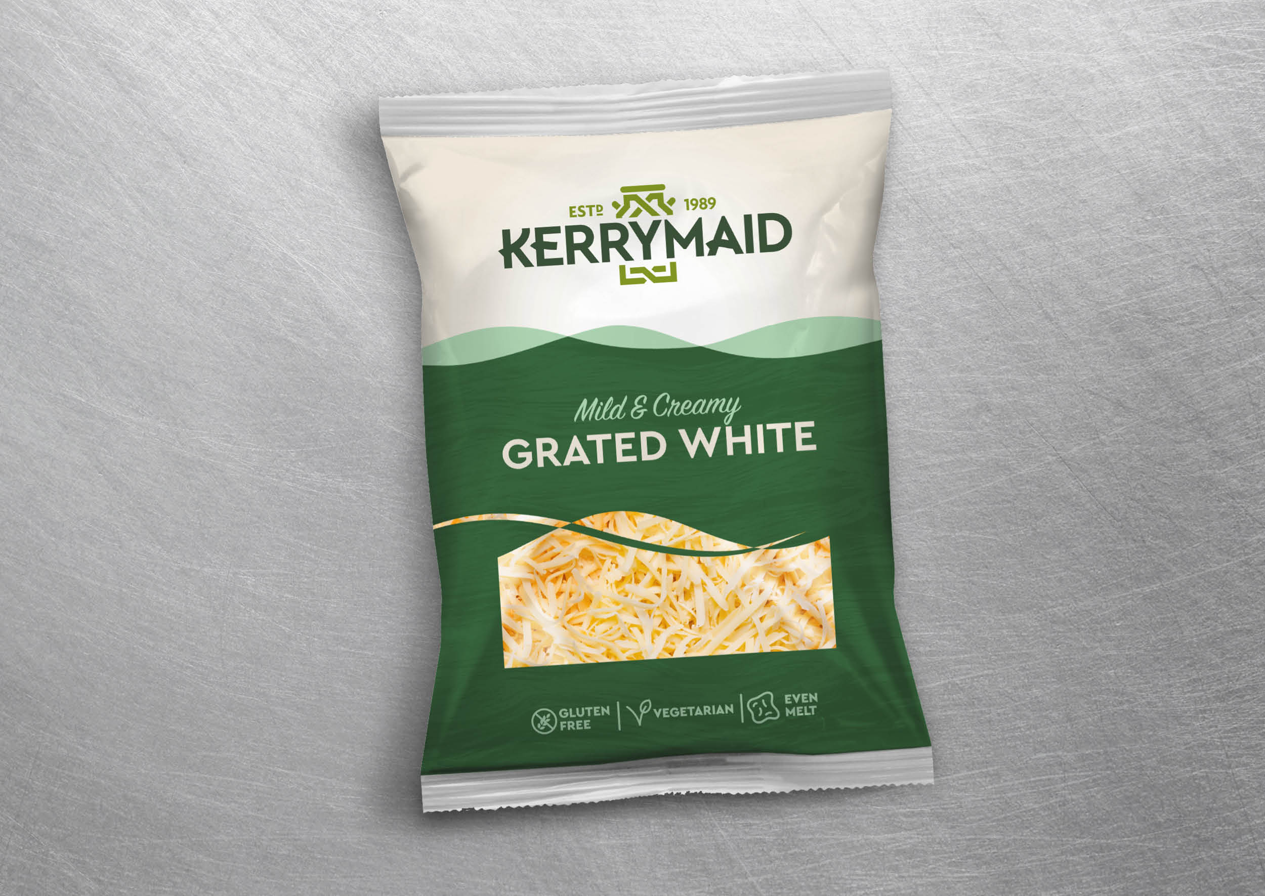
The Kerrymaid brand identity was redrawn and crafted to celebrate the dairy brand’s Irish heritage. The logotype was simplified with touches of personality alongside the redrawn churn, both taking inspiration from Celtic art. The end result is an identity that fits well with the brand personality of Contemporary Irish.
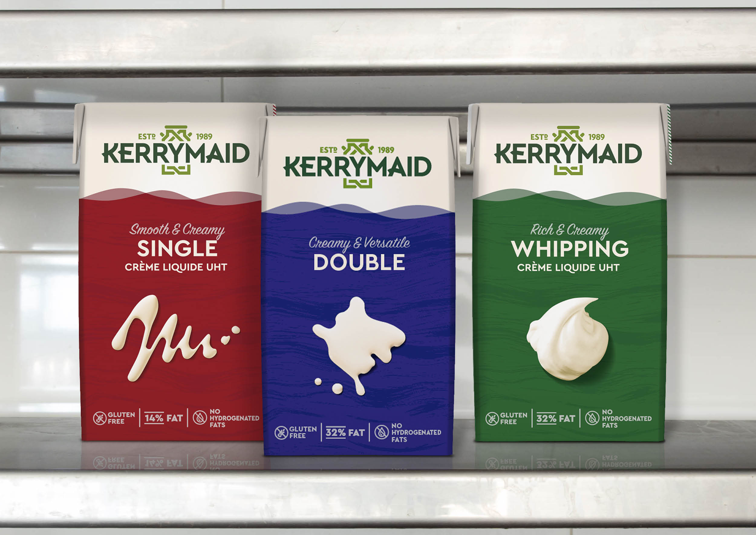
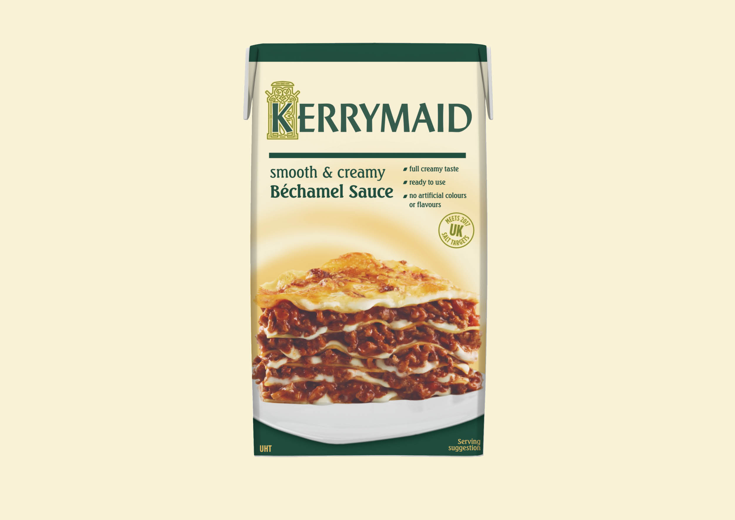
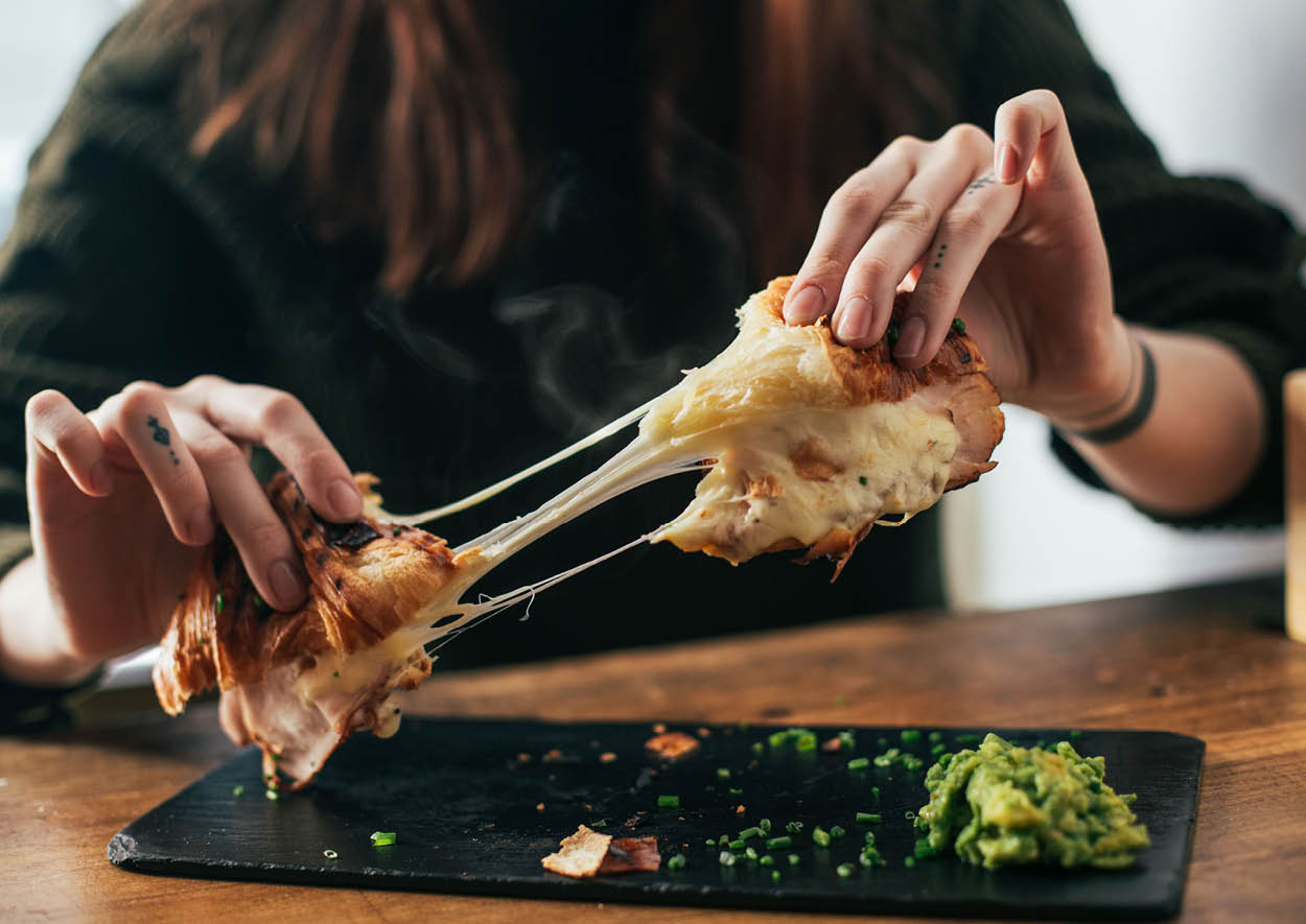
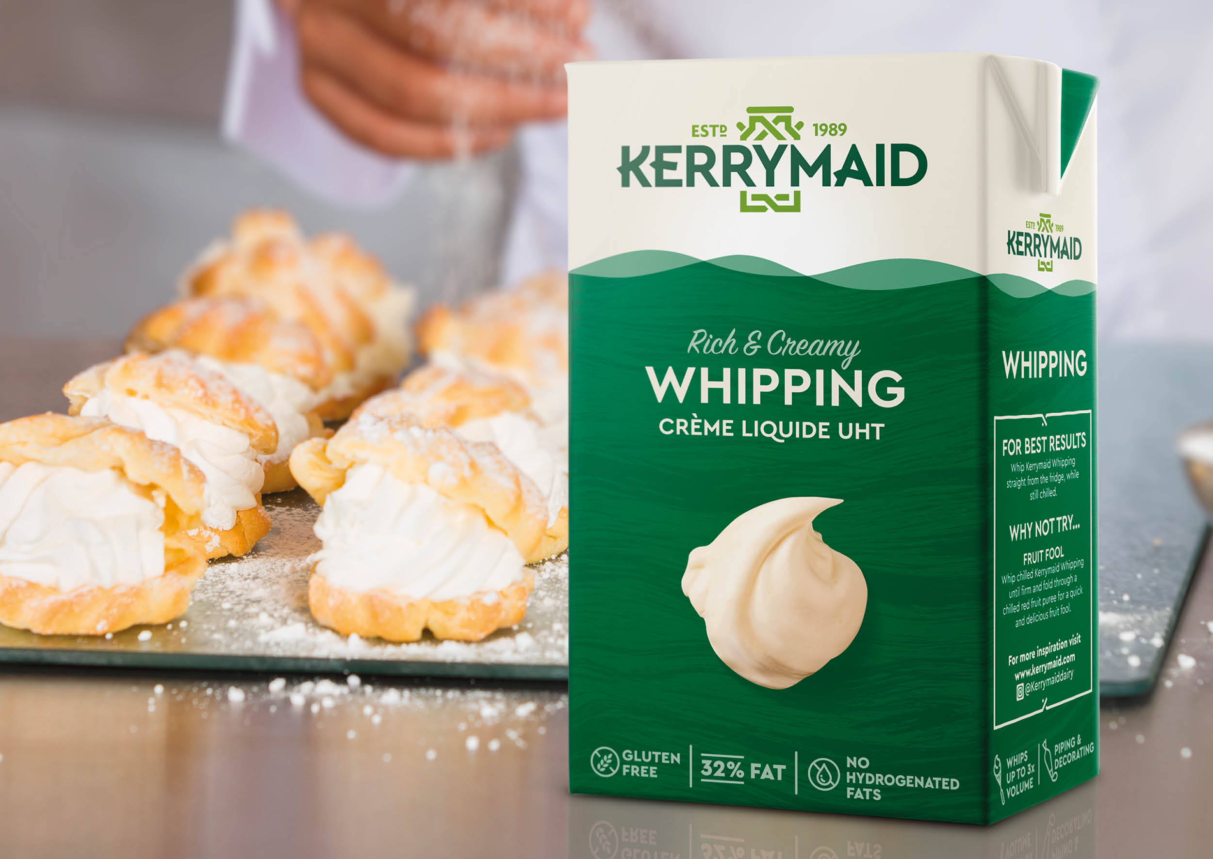
The pack graphics depict the smooth flow of dairy with a nod to the rolling hills of county Kerry, where the brand was established. Hero photography highlights the key characteristics of each product, showcasing the creativity Kerrymaid products allow and more importantly moving away from the dated and uninspiring recipe shots from previous design.
The whole pack was considered during the redesign, from insightful recipe suggestions on side of pack, through to the creation of an allergen table as part of the full back of pack layout to ensure the redesign was as highly functional as it was beautiful, giving chefs freedom to cook with confidence.
The rebrand has been well recieved, with increased listings and sales growth. Along with exciting and ground breaking new product development taking place, the Kerrymaid range is going from strength to strength and has truly re-established itself as the leader in the dairy B2B sector.
