Packaging Design | Visual Language | Guidelines | Website | Artwork
Organic by name, organic by nature
Challenge
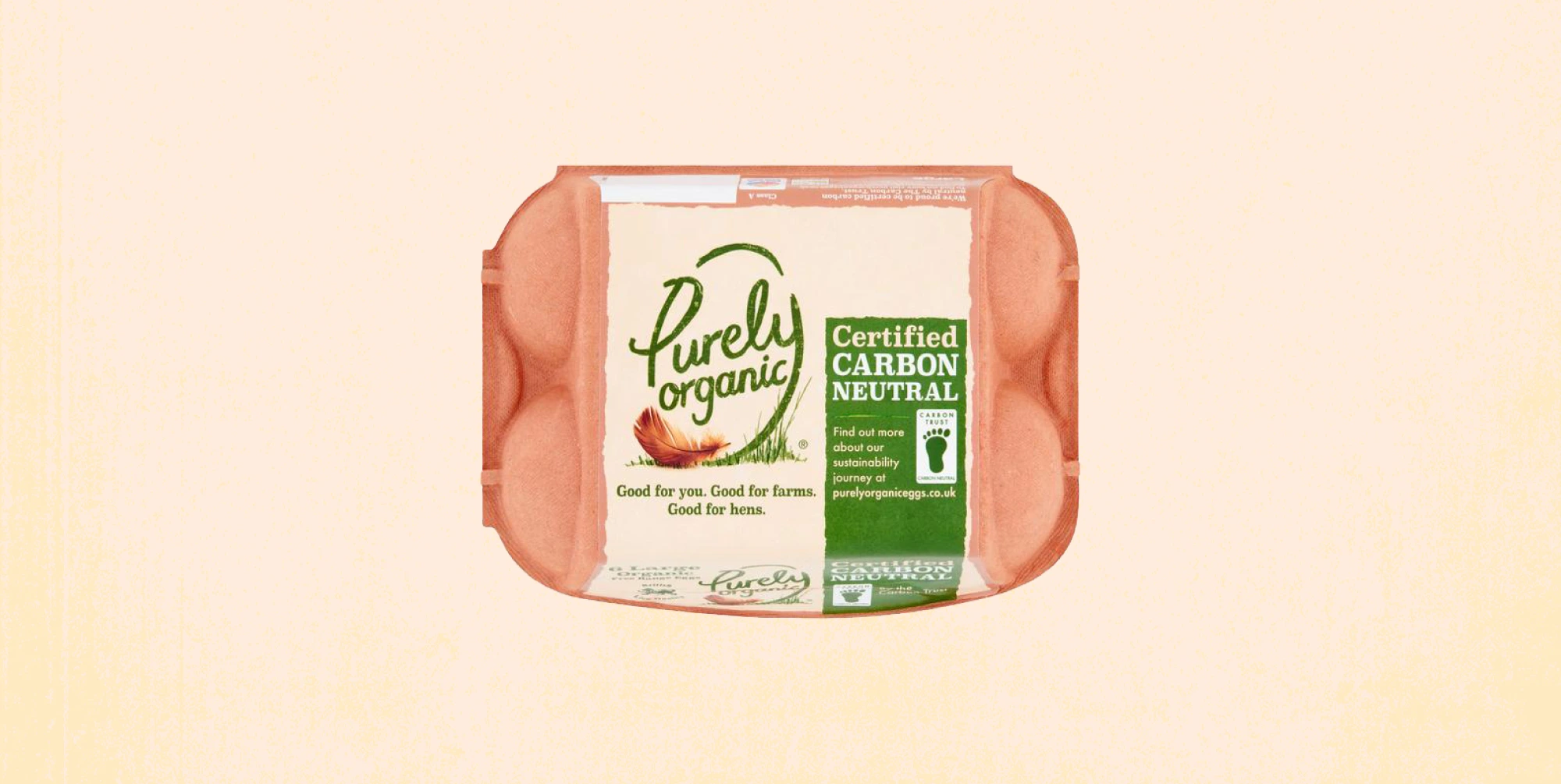
There is a lot to love about the way Purely Organic produce their eggs. They have always had a deep respect and care for hens and nature. However, the packaging lacked warmth and modernity. When we got the chance to freshen things up, we couldn’t wait to get cracking (pun intended).

Approach
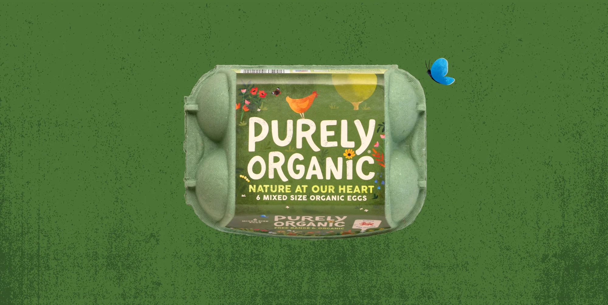
There are times when shaping brand strategy is wonderfully straightforward. For Purely Organic, we were struck by the genuine care and passion for nature that ran through their ethos; every farm is a little haven of nature. This drove the core strategic thought: ‘Nature at our heart’.
The design dramatises an idealised view of flourishing nature: the birds, the butterflies, the green fields, and the happy hens, all of which are remarkably close to the reality of the farms, with no additional creative license needed. In addition, lightness of touch through the illustrations and identity ensures we never stray into that branding cul de sac of worthiness.
The new design has made a big splash in store, with the bold green boxes and shelf-ready-packaging standing out in a sea of beige and brown. We’ve also supported the redesign launch with a new website that we designed and built, in-store communication, plus more exciting plans for the future.
“Honey have been great brand partners for us. They helped bring real clarity in developing the positioning for Purely Organic and we are thrilled with the new packaging design. It has warmth, optimism as well as great stand out from the competition. Thanks Honey”
Anita Nutchey, Marketing Manager, Noble Foods