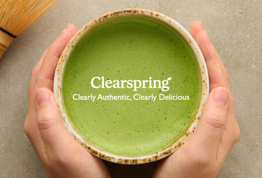
Clearspring
Championing a food brand like no other.
We work in a wide range of areas. We love the challenge of making your brand do more no matter what the application. Take a look at some examples below.
Championing a food brand like no other.
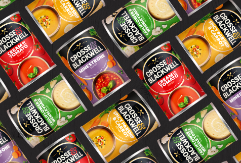
A fresh look for the original soup experts
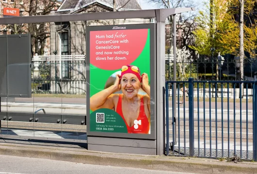
Raising awareness for a private cancer care provider
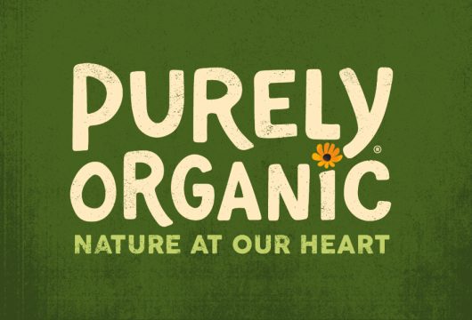
Organic by name, organic by nature
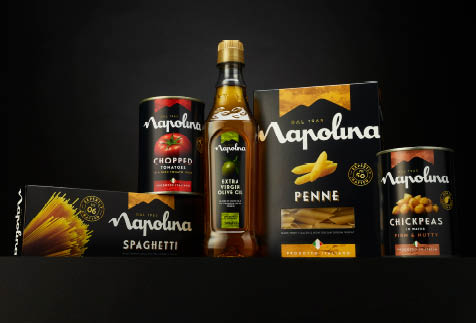
Injecting the spirit of Napoli into a much loved family favourite
Love the good stuff

A smarter solution for the pension market
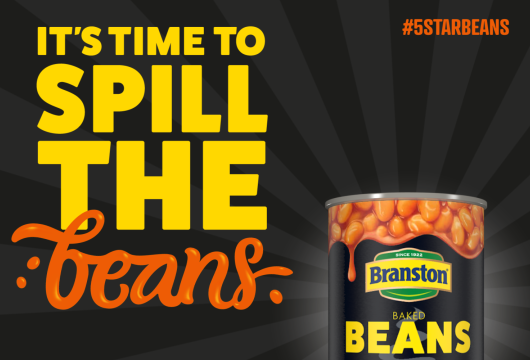
Five Star advertising for Five Star beans
A fresh approach in the world of recruitment
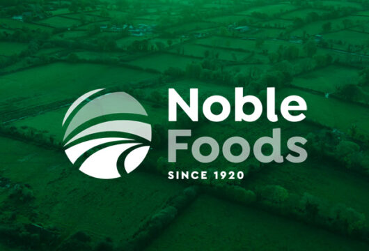
A positive creative step change for Noble Foods
Pin point creative positioning
Creative courage brought to life

Clearing the path for growth
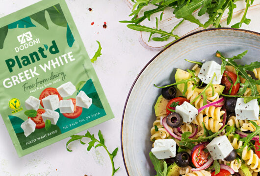
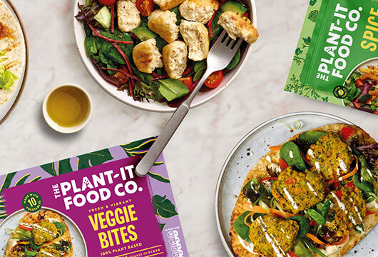
Driving competitive advantage, free from dairy but not free from taste
So much more to explore
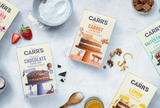
Shaking up the cake mix category
A bold new brand in tech services

Diving into a new recruitment brand
Creating a challenger pensions brand
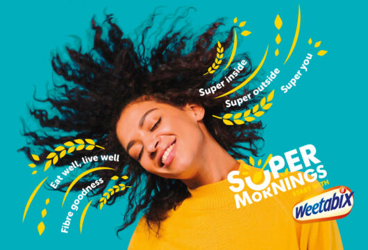
Mornings just got super
DaVinci Gourmet® offer a range of products specifically formulated for mixologists and baristas